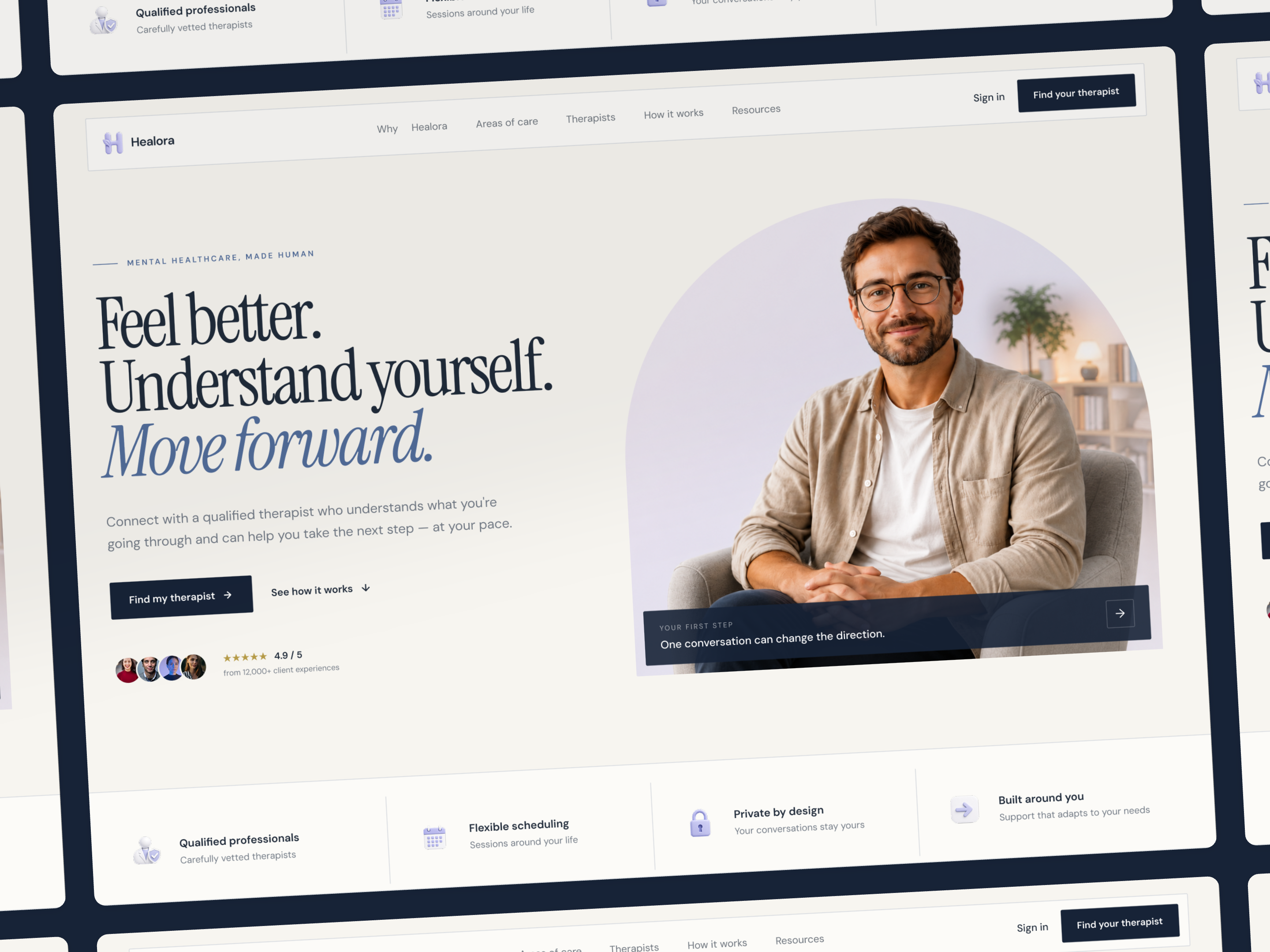
Mental Healthcare Landing Page
Feel better. Understand yourself. Move forward.
Feel better. Understand yourself. Move forward.
Designing a more human first step.
Mental healthcare can feel difficult to approach. The experience needed to balance trust, clarity, and warmth without feeling overly clinical.
The goal was to create a clear journey that helps visitors understand the service, explore their needs, find support, and take the next step with confidence.
UX Direction
From uncertainty to action.
The experience was structured around a simple user journey:

Information Architecture
A clearer path through the experience.
The page was organized to introduce information progressively rather than presenting everything at once.
This creates a natural progression from first impression to decision, ensuring the user is never overwhelmed with choices before they understand the value.

Project Goals
Clear, calm, and personal.
Three decisions shaped the experience:

Constraints
Balancing trust, clarity, and emotion.
A single landing page needed to communicate the service, establish credibility, help visitors explore different areas of mental health support, introduce professionals, and provide helpful resources — while keeping the experience calm, approachable, and easy to navigate.
Visual Direction
Moving away from the clinical look.
The visual language combines editorial typography, warm neutrals, soft lavender, deep navy, and human-centered photography to create a warmer, more approachable healthcare experience.
The challenge was keeping the softer aesthetic from becoming too decorative. The visual system therefore uses restrained components, strong contrast, and consistent patterns to keep the experience clear, credible, and easy to navigate.


From UX to UI
Turning the structure into a visual experience.
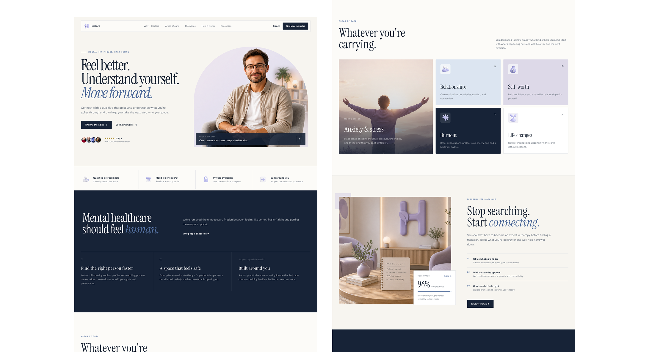
Once the content hierarchy and user journey were defined, the interface was shaped around the same principles: calm visual rhythm, clear hierarchy, and human moments throughout the experience.
The UI gives each stage enough space to communicate without overwhelming the visitor.
Wireframe


UI

LEARNINGS
Designing with empathy and intention.
This project reinforced that designing a mental healthcare experience is about more than creating a calm visual language. The challenge was finding the right balance between empathy, clarity, and trust while keeping the experience simple enough to navigate.
Here are a few takeaways I took from the project:
Design for trust before conversion.
In mental healthcare, asking someone to take action requires more than a clear CTA. The experience needs to create enough comfort and confidence for that decision to feel natural. This influenced the use of human photography, softer colors, testimonials, and the gradual progression from understanding to action.
Structure should come before styling.
One of the strongest decisions was defining the journey before refining the visual language. Organizing the experience around Understand → Explore → Connect → Act helped give every section a clear purpose and prevented the landing page from becoming a collection of visually attractive sections.
A human interface still needs clarity.
It was important not to let the softer, editorial direction compromise usability. Typography, spacing, contrast, component consistency, and content hierarchy had to remain clear while maintaining the warmer personality of the brand.
Build the visual language as a system.
Creating the typography, color palette, components, cards, buttons, and spacing rules early made the final interface more cohesive. It also made it easier to maintain consistency as the landing page evolved.