Design Products
That Matter.
I turn complex problems into simple, useful digital experiences.
Productdesignerwith6+yearsofexperience,avisualartist’seye,andadeveloper’smindset.
Idon’tjustdesigninterfaces.Iturncomplexideasintodigitalproductsthatfeelsimple,purposeful,andhuman.
UI/UX Design
Designing thoughtful, user-centered digital products that balance clarity, usability, and visual impact. From complex user flows to polished interfaces, every decision is made to create a better product experience.
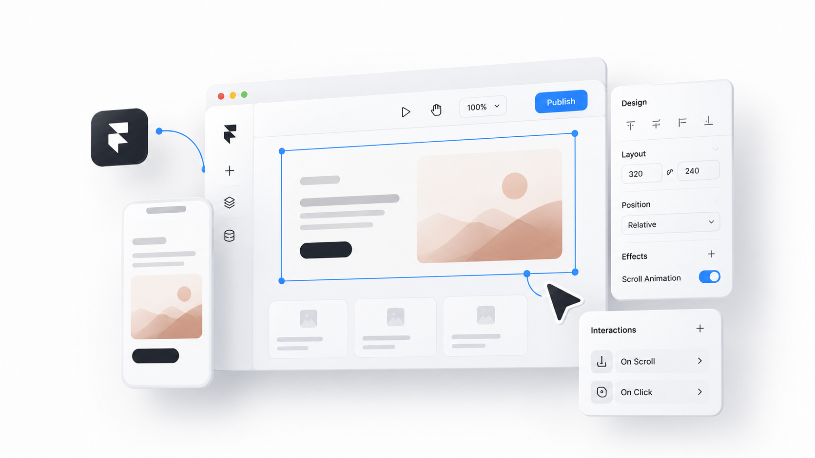
Framer Development
Building polished, scalable websites in Framer with a strong focus on CMS, responsive layouts, interactions, and performance. From simple marketing sites to content-rich platforms, I turn designs into fast, flexible, and easy-to-manage experiences.
Copywriting
Crafting clear, purposeful copy that gives digital products a stronger voice and makes every message easier to understand. From headlines and CTAs to product messaging, I turn ideas into words that guide, engage, and convert.
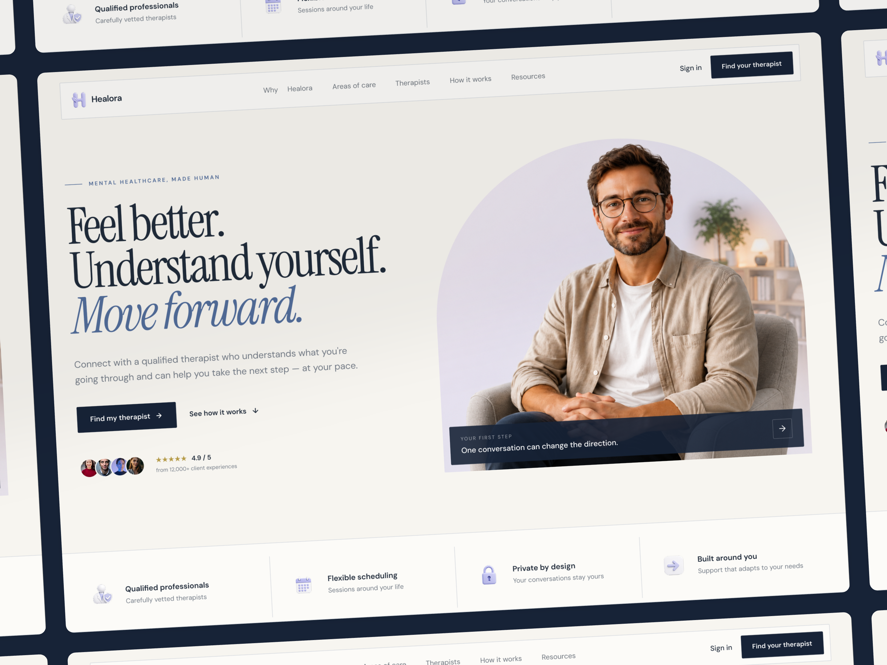
Mental Healthcare Landing Page
Designing a more human first step.
Mental healthcare can feel difficult to approach. The experience needed to balance trust, clarity, and warmth without feeling overly clinical.
The goal was to create a clear journey that helps visitors understand the service, explore their needs, find support, and take the next step with confidence.
UX Direction
From uncertainty to action.
The experience was structured around a simple user journey:
Information Architecture
A clearer path through the experience.
The page was organized to introduce information progressively rather than presenting everything at once.
This creates a natural progression from first impression to decision, ensuring the user is never overwhelmed with choices before they understand the value.
Project Goals
Clear, calm, and personal.
Three decisions shaped the experience:
Constraints
Balancing trust, clarity, and emotion.
A single landing page needed to communicate the service, establish credibility, help visitors explore different areas of mental health support, introduce professionals, and provide helpful resources — while keeping the experience calm, approachable, and easy to navigate.
Visual Direction
Moving away from the clinical look.
The visual language combines editorial typography, warm neutrals, soft lavender, deep navy, and human-centered photography to create a warmer, more approachable healthcare experience.
The challenge was keeping the softer aesthetic from becoming too decorative. The visual system therefore uses restrained components, strong contrast, and consistent patterns to keep the experience clear, credible, and easy to navigate.
From UX to UI
Turning the structure into a visual experience.
Once the content hierarchy and user journey were defined, the interface was shaped around the same principles: calm visual rhythm, clear hierarchy, and human moments throughout the experience.
The UI gives each stage enough space to communicate without overwhelming the visitor.
Wireframe
UI
LEARNINGS
Designing with empathy and intention.
This project reinforced that designing a mental healthcare experience is about more than creating a calm visual language. The challenge was finding the right balance between empathy, clarity, and trust while keeping the experience simple enough to navigate.
Here are a few takeaways I took from the project:
Design for trust before conversion.
In mental healthcare, asking someone to take action requires more than a clear CTA. The experience needs to create enough comfort and confidence for that decision to feel natural. This influenced the use of human photography, softer colors, testimonials, and the gradual progression from understanding to action.
Structure should come before styling.
One of the strongest decisions was defining the journey before refining the visual language. Organizing the experience around Understand → Explore → Connect → Act helped give every section a clear purpose and prevented the landing page from becoming a collection of visually attractive sections.
A human interface still needs clarity.
It was important not to let the softer, editorial direction compromise usability. Typography, spacing, contrast, component consistency, and content hierarchy had to remain clear while maintaining the warmer personality of the brand.
Build the visual language as a system.
Creating the typography, color palette, components, cards, buttons, and spacing rules early made the final interface more cohesive. It also made it easier to maintain consistency as the landing page evolved.
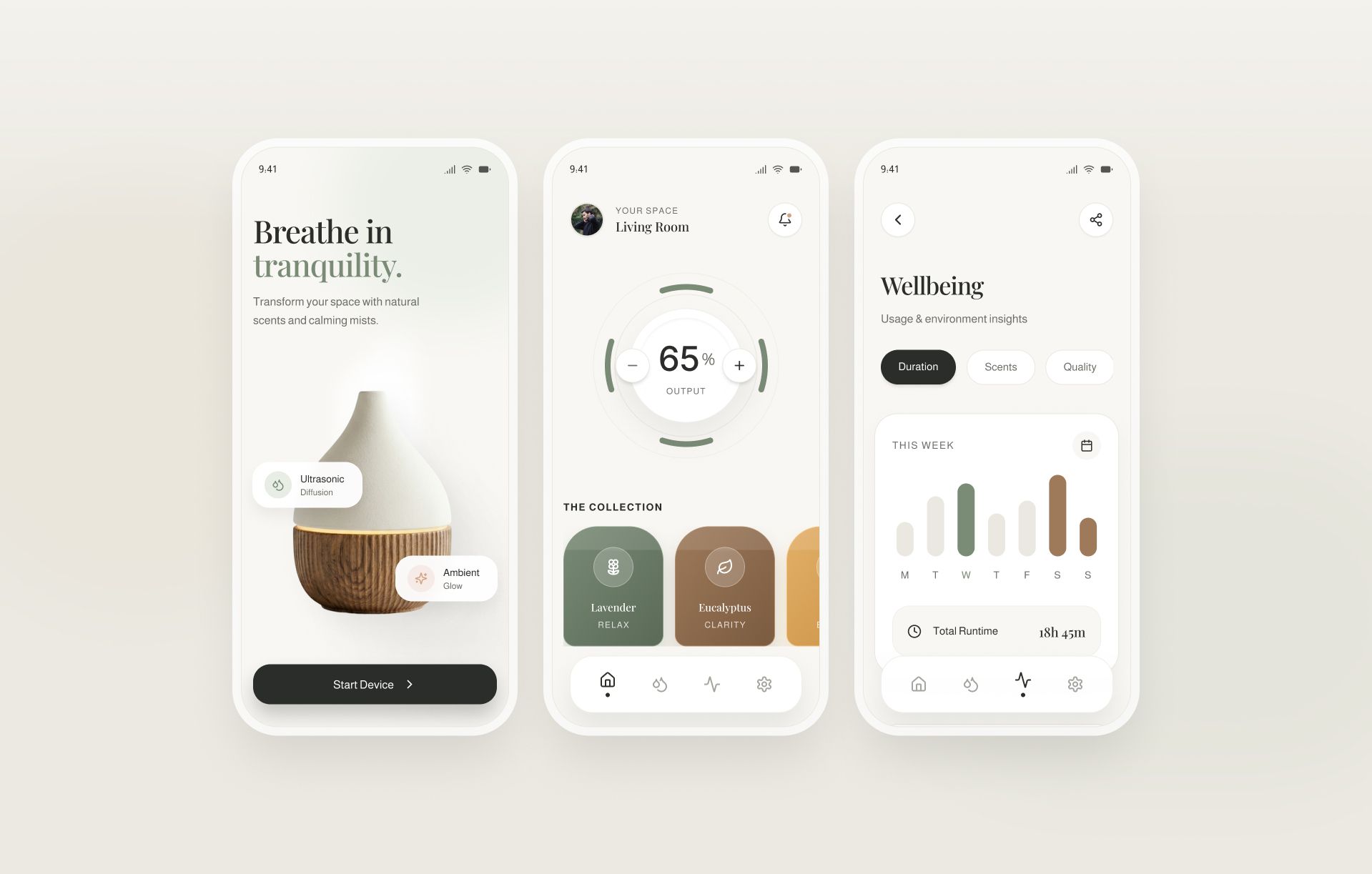
Breathe in tranquility: A Smart Wellness Concept
Designing a smart wellness experience should feel grounded and intuitive, never clinical.
For this smart diffuser app, I wanted the digital interface to mirror the physical act of unwinding. By combining editorial typography with a soft, earthy color palette, the design keeps the focus purely on relaxation.
Key details of this approach:
• Organic interactions: Tactile, rounded controls—like the circular output dial—make adjustments feel completely natural.
• Earthy visual system: Muted greens, warm terracottas, and generous whitespace create a calming atmosphere.
• Gentle insights: Wellbeing data and usage charts are integrated softly to inform, rather than overwhelm.
The goal was simple: make controlling a smart device feel less like operating machinery, and more like taking a restorative breath.
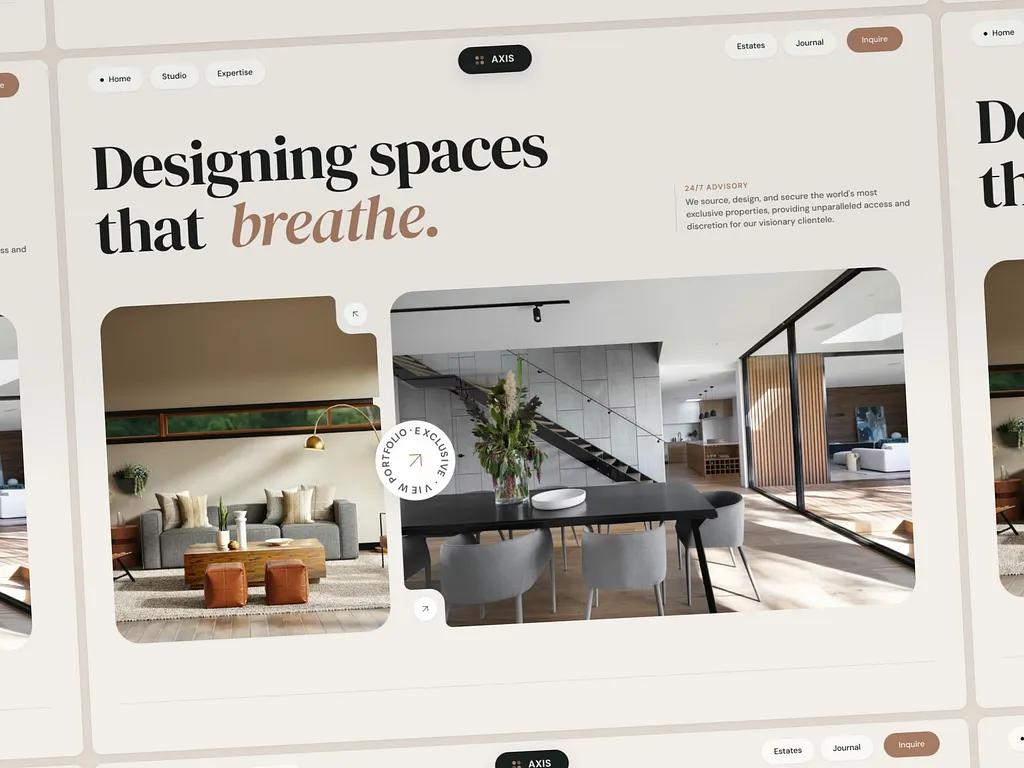
AXIS Studio — Luxury Architecture & Real Estate Platform Abdullah Fuad
Visionary architecture deserves a digital presence that reflects its physical grandeur — not just a conventional portfolio.
I designed the AXIS Studio home page to communicate spatial harmony and architectural exclusivity from the very first scroll.
✨ Key Details:
• Precision Cutouts: A disciplined interlocking bento structure with refined squircle corner cutouts that create a tactile architectural rhythm.
• Earth & Slate Palette: Deep slate surfaces, warm alabaster tones, and muted terracotta accents replace harsh contrast to express organic luxury and timeless sophistication.
• Typographic Presence: The expressive elegance of DM Serif Display is balanced with the clean geometric clarity of DM Sans, establishing confidence and visual hierarchy.
• Curated Experience: Layered immersive photography and a frosted-glass inquiry interface introduce a sense of discretion, depth, and premium service.
What do you think about bringing this spatial luxury approach to the real estate industry? Share your thoughts below. 👇
Full page
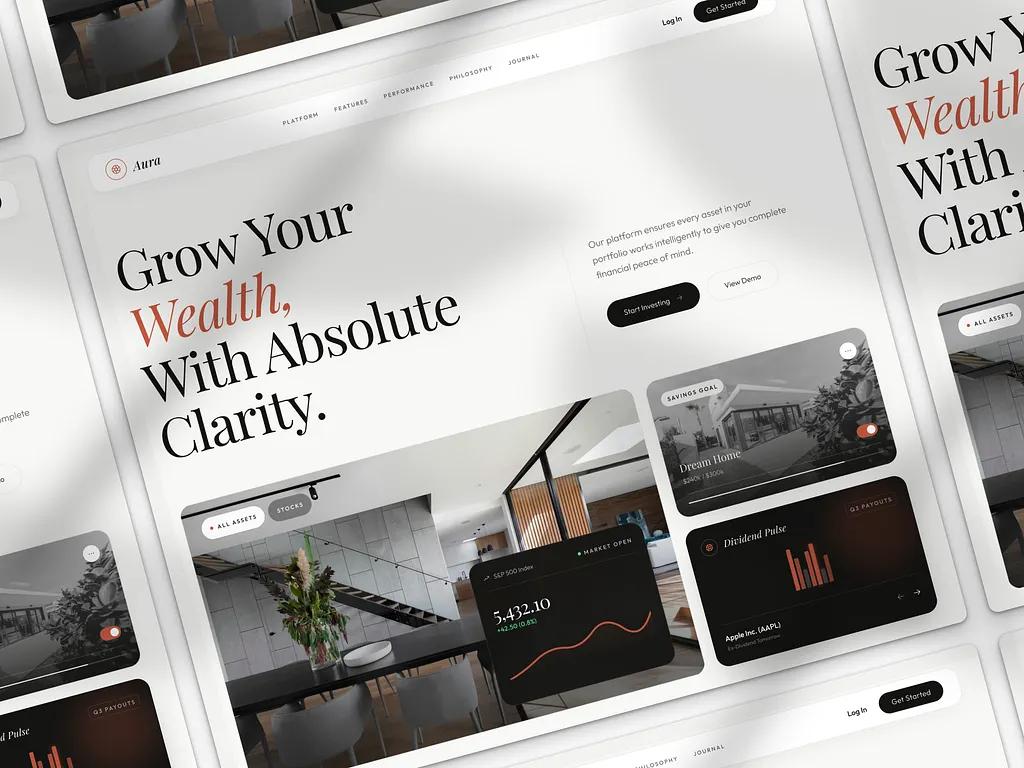
Aura — Editorial Landing page for Wealth Management
Designing the entry point to a high-net-worth wealth platform shouldn’t feel like promoting a generic fintech product.
I created Aura as a refined editorial landing experience — crafted to introduce the intelligence, clarity, and composure of the wealth dashboard before users even enter the system.
✨ Key Details:
• Structured Bento Grid: A disciplined modular layout with delicate hairline dividers establishes a calm visual rhythm and simplifies the scanning of complex financial data.
• Paper & Ink Palette: Warm off-white surfaces, deep ink tones, and restrained terracotta accents replace typical fintech neon colors to communicate trust, heritage, and quiet luxury.
• Typographic Authority: Elegant serif headlines create strong financial presence for key metrics, while a clean geometric sans-serif ensures precision and readability across dense information.
• Curated Visual Focus: Soft architectural imagery and subtle depth layers provide atmosphere without competing with portfolio performance and intelligent insights.
What do you think of this editorial approach to fintech? Drop a comment below! 👇
Full Page
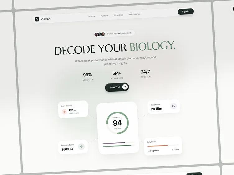
Vitala: Premium AI Health & Longevity OS
Decoding your biology shouldn’t feel overwhelming.
I designed Vitala to translate complex health data into calm, actionable insights through a refined clinical-wellness interface that feels both trustworthy and premium.
✨ Key Details
• Unified daily readiness scoring and long-term health trend visualization
• Soft ambient surfaces and elevated card layouts for a composed medical-inspired experience
• Privacy-first product storytelling highlighting secure data handling and user trust
The layout works harmoniously with the typography system — large editorial headings create emotional presence, while compact functional text blocks ensure readability and flow across dense data moments.
What do you think of this elegant typography pairing (Marcellus + DM Sans)?
Drop a comment below! 👇
Full page
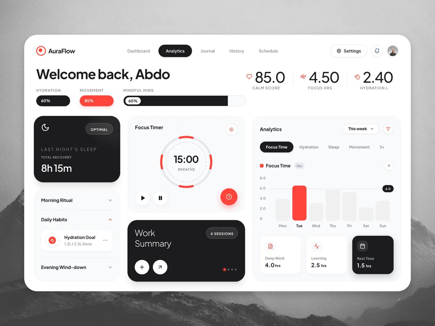
AuraFlow — Premium Wellness & Productivity Dashboard
Personal wellness deserves a digital presence that reflects mental clarity — not just a cluttered analytics screen. I designed the AuraFlow dashboard to communicate balanced energy and focused productivity from the very first glance.
✨ Key Details:
• Precision Bento Structure: A disciplined interlocking grid with refined pill shapes and segmented gauges that create a tactile, breathable rhythm.
• Obsidian & Alabaster Palette: Deep slate surfaces, pristine white backgrounds, and vibrant crimson accents replace harsh noise to express vital energy and timeless sophistication.
• Typographic Presence: The high-end geometric elegance of Plus Jakarta Sans is balanced with tight kerning on massive data points, establishing confidence and a pristine visual hierarchy.
• Curated Experience: Immersive dark-mode focus widgets and a beautifully crafted custom timer introduce a sense of serene control, depth, and mindful tracking.